


A new chart analysis shared by Peter Brandt focuses on silver’s long-term structure using quarterly data, with particular attention on the Average Directional Index (ADX).
The commentary frames silver as being well removed from overbought conditions, despite the recent expansion in price. The analysis is based solely on the quarterly ADX, which is described as the only indicator used in this assessment.
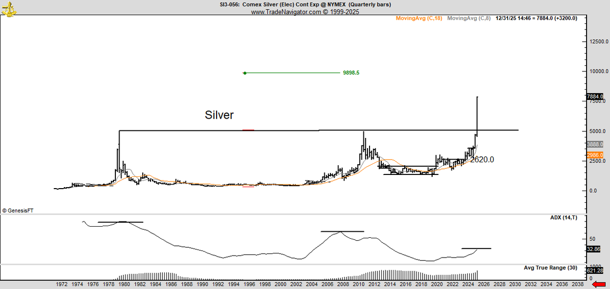
The chart displays silver price action across multiple decades, highlighting a prolonged consolidation followed by a powerful breakout. Price has recently pushed decisively above a long-standing horizontal resistance zone, marking a structural shift on the highest time frame shown. This breakout occurs while trend strength, as measured by ADX, remains comparatively restrained.
What the Quarterly Chart Shows
The chart shows silver spending many years trading below a clearly defined resistance band before finally breaking above it. Once price clears that range, the vertical expansion becomes more pronounced, suggesting a transition into a new regime rather than a short-term move. The breakout candle on the right side of the chart stands out visually, extending well above prior highs.
Below the price chart, the quarterly ADX line is shown rising but still far from levels typically associated with overheated trends. The ADX reading remains moderate, indicating that trend strength is building but has not yet reached extreme territory. This combination of a fresh structural breakout and a relatively contained ADX forms the core of the analysis.
Why ADX Matters in This Context
The analysis highlights that ADX measures trend strength rather than direction. In this case, the quarterly ADX suggests that silver’s trend is strengthening without showing signs of exhaustion. From this perspective, the market is not displaying the type of elevated trend intensity often seen near long-term peaks.
Based on this framework, the commentary suggests that silver is far from overbought on a structural basis. The chart supports this view by showing ample historical room for ADX expansion before reaching levels associated with prior major tops.
Upside Case Versus Correction Risk
The analysis states that a case can be made for significantly higher prices, with a long-term level of $147 mentioned as a potential objective derived from the broader structure. However, the commentary also raises an important question: where a large or prolonged correction might originate.
The chart does not show immediate technical exhaustion, but the magnitude of the breakout implies that volatility and corrective phases are likely to occur along the way. The absence of ADX extremes suggests that any future correction would come from price structure rather than trend saturation.
What the Structure Implies Now
Taken together, the chart shows silver in a strong long-term uptrend that is still developing rather than concluding. Price has broken into a new range while trend strength remains relatively contained. This combination implies expansion potential remains, even as the risk of sharp corrections grows with continued price acceleration.
Based strictly on what the chart and commentary show, silver appears structurally strong on the quarterly timeframe, with trend strength still far from levels historically associated with overbought conditions.


