


At first glance, Bitcoin’s price history looks volatile, chaotic, and emotionally exhausting. Sharp rallies are followed by deep pullbacks, headlines swing from euphoria to panic, and short-term narratives constantly change.
Yet when Bitcoin’s full history is viewed on a long-term scale, a very different story emerges, one defined by persistence, structure, and steady expansion over time.
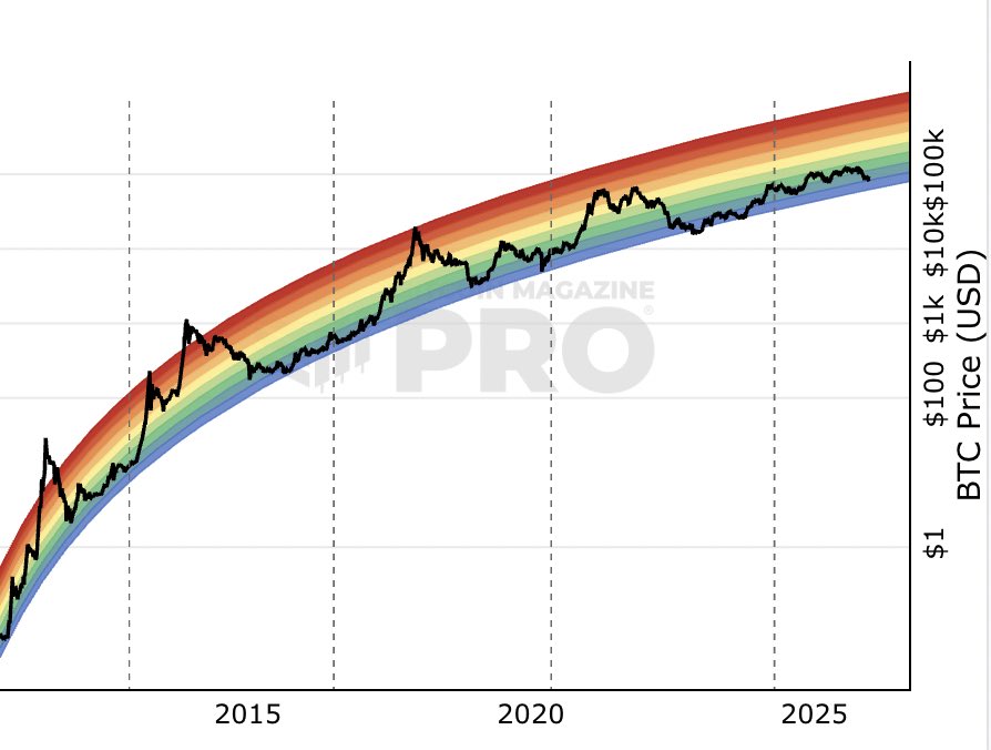
The chart illustrates Bitcoin’s price plotted across multiple market cycles using a long-term trend framework. Despite dramatic drawdowns along the way, price action consistently remains within a rising channel. Each major correction ultimately resolves higher than the previous cycle’s lows, reinforcing the idea that volatility is a feature of Bitcoin’s growth, not a sign of failure.
What stands out most is how periods that once felt catastrophic now appear as brief pauses within a broader upward trajectory. Bear markets compress, recoveries accelerate, and adoption-driven demand gradually pushes the network’s valuation higher. This perspective helps explain why long-term holders often emphasize patience over prediction, Bitcoin has rewarded those willing to endure short-term discomfort.
The message behind the chart, shared by Bitcoin Magazine, is simple: context matters. Zooming out removes emotional bias and reframes volatility as part of a larger, ongoing expansion.
Rather than a series of disconnected bull and bear markets, Bitcoin’s history reads as one long, uneven ascent shaped by cycles, but anchored by a persistent upward trend.
In that sense, Bitcoin hasn’t needed to “restart” its bull market, it has simply continued evolving through it.


